Website rebrand 2021 - INDEPENDENT
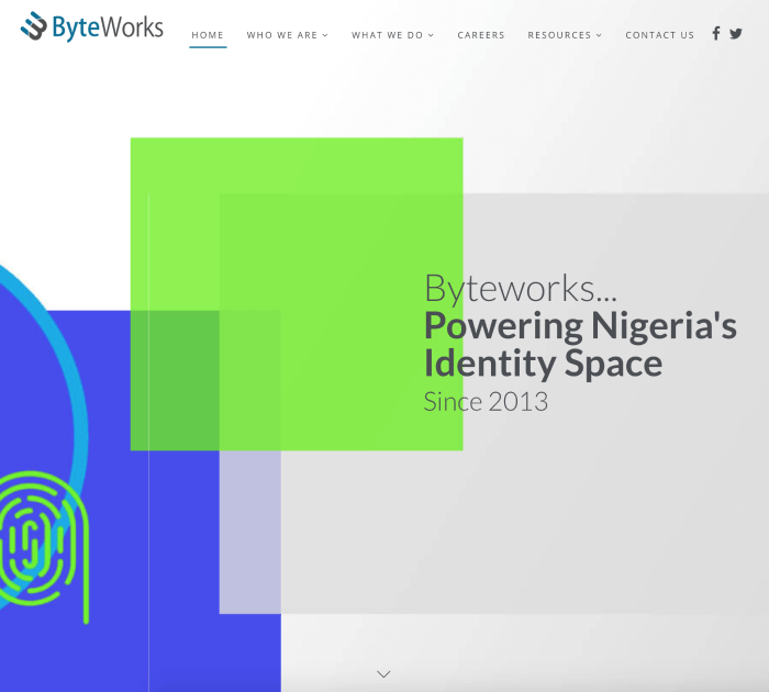
Byteworks Website
My Role Research, UX Design, UI Design, HTML and CSS | Platforms: Desktop, Mobile Web | Year: 2021
A LITTLE BIT OF A BACKGROUND
This is an organization’s widely important goal that involves app research, user flow, wireframes, visual mocks, prototypes (Figma), and an website completed in 12 weeks. Thank you to the Byteworks design team (Dani and Innocent) for working together with me in this and also for their weekly critiques and support. You can visit the site here
WHAT DROVE US TO REDESIGN THE WEBSITE?
The Organization was going through some restructuring and wanted a new website to showcase a new standards of delivering the highest quality software with 4Dx (4 disiplines of execution) and the “Kaizen” principles. We have redesigned the Byteworks Corporate Website to represent the new image of the organization at it’s core.
From the Homepage to About Us to our Project Portfolio, the new Byteworks website is meant to represent what the organisation do and what she stand for.

User Research & Problem Finding
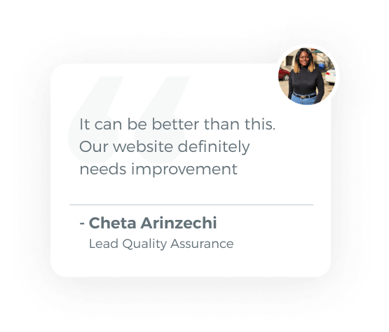
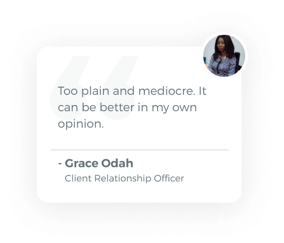
We conducted some interviews, did analysis, brainstorming, and prototyping. We tried to find out the pain points and frustrations while trying to get information on how to improve the current website.
Questions we asked during the causal interview:
- What do you think about the current Byteworks Corporate Website in general?
- How was you User Experience when using/visiting the current website?
- What possible fixes / updates / enhancements would you propose for the redesing of the website?
Revised Site Map for ByteWorks Website

Problems and solutions
After doing the user interview, share a user persona form, discussions we noted down the pain points, their frustrations, their goals.
Although the current website has been used over 10 years, there are facing some major issues with the current solution. We mentioned some design issues, some technical problems and usability issues.
| Pain points & frustrations | Solutions can be done | |
|---|---|---|
| Website information and content seems outdated and non-informative | Provide more up to date information on the organization’s portfolio | |
| Contact information (Phone number) seems to be out of date | Provide an updated working contact detail on the corporate website | |
| The design of the website is old and need a better UI representation | Provide an updated working contact detail on the corporate website | |
| The coporate profile and portfolio of the organsation seems to be very outdated | Redesign the currently existing website following more mordern and up to date UI standards and principles |
DESIGN SOLUTION-01
A more focused landing page and navigation
First things first, and the most important of all is the Homepage, where at a glance you shoud be able to know what the business is all about. What I focused on here is to create the easiest user experience by building a very clear and understandable navigation menu where users could find the most crucial items they might need as e.g about us, our teams, careers, etc.
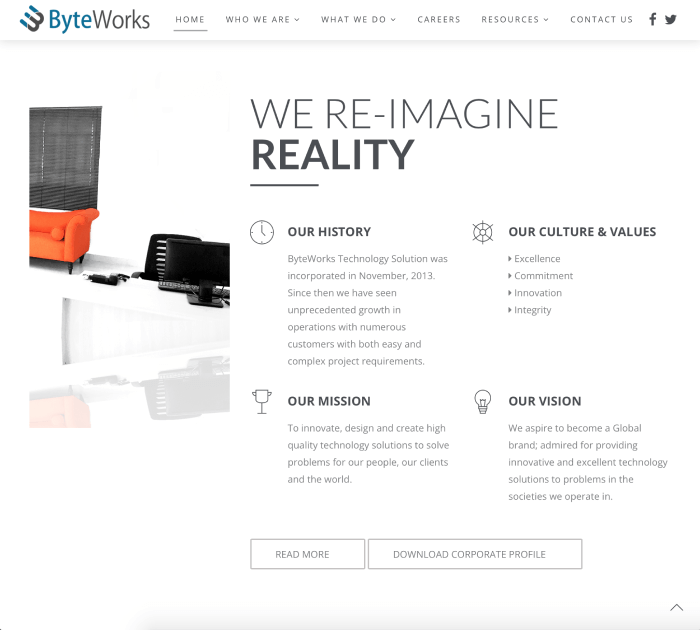
Current version of the landing page and navigation.
Opportunities for improvement
In examining the current design from top to down. The navigation menu seemed confusing, lacking a sense of visual hierarchy and the ability to scale with more items added to the list. Plus the organization wanted a way to pass a central message about their services on landing to the site
Solution exploration

A streamlined navigation and a dedicated campaign banner slider for each menu item + A unique background video that improves engagment and upgrades the over all appeal of the site.

DESIGN SOLUTION-02
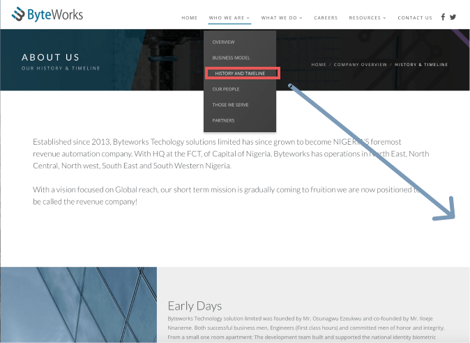
A smart and intuitive Timeline module
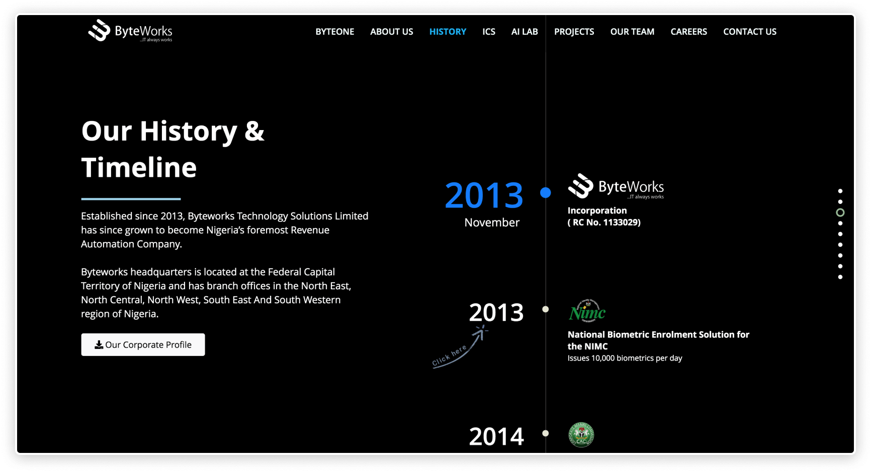
Companies want users to be able to have an idea of what they have acheived over the years at a glance. But that does not mean it should be all over the place on the webpage. Plus since we are going wih the approch of a onepage site, dedicating a single slide to show the history of the company would be an improvement. Only when a visitor selects a particular year, will he be able to see the following year revealed with the project completed for that year also visible. This allows the user interact more with the site and enjoy the experience of gradually unveilling the organization’s history.
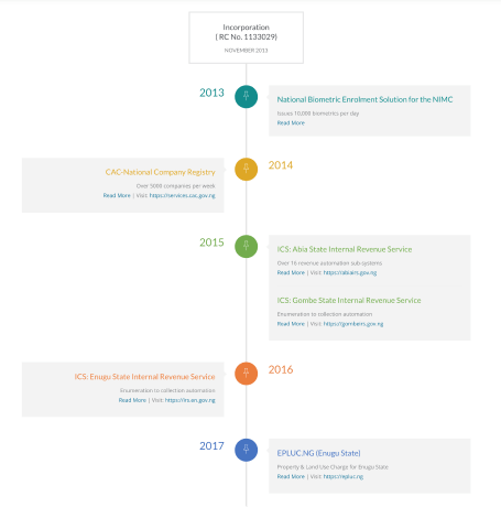
Current version of the timeline and history module
Opportunities for improvement
By examining the current timeline page, we saw the following opportunities to improve the intuitiveness and present the information is a better way
Solution exploration

An updated company profile with new products added + Recall company’s timeline history triggered by a visitors click event
Some challenges I faced
As much as victories were recorded, there were major huddles I encountered during the course of this project. Due to time constraints, the research and consequents assumptions are not up to a satisfactory threshold. Many assumptions were made without proper validation. A deeper analysis and additional testing needs to be conducted in order to refine and validate the solutions.