Mobile Web app design 2021 - INDEPENDENT
Bookstore Marketplace
My Role Research, UX Design, UI Design, App Branding | Platforms: Desktop, Mobile Web | Year: 2021
About this project
The main goal is to create an online bookstore marketplace for the urban generation where users can go and search for books they love to read and purchase them online.
Users can also leave their feedback on the books they have already read on the platform.
User Research & Problem Finding
The first step involves me conducting research to better understand the scope of the project and empathize with the users - their needs, motivations, etc.
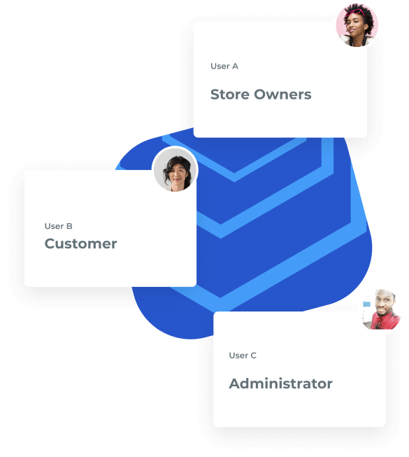
For the Bookstore Marketplace project, 3 main user groups were identified:
- Store Owners (Individual who register to sell books in the BM platform)
- Customers (Users looking to purchase books from the BM platform)
- Admin (The system administrator who manages the entire data base on the BM platform)
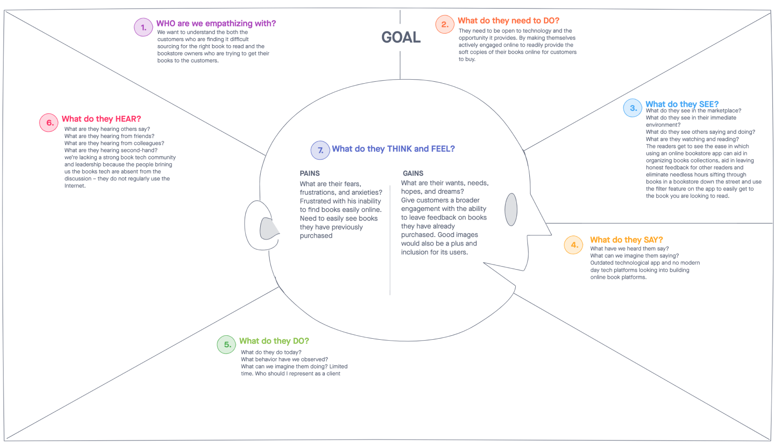
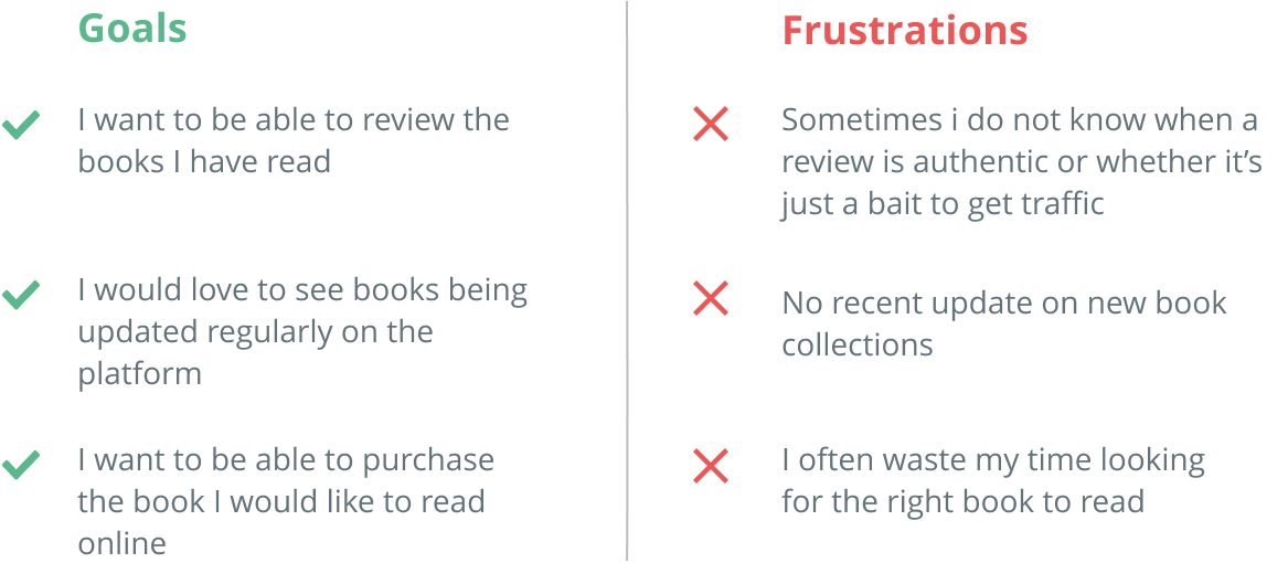
For the purpose of this case study, the focus of my user research was on the customers. I conducted user interviews with some users to better understand their needs and generated an empathy map which provided more clarity.
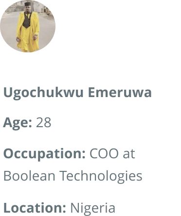
User Persona
Ideation
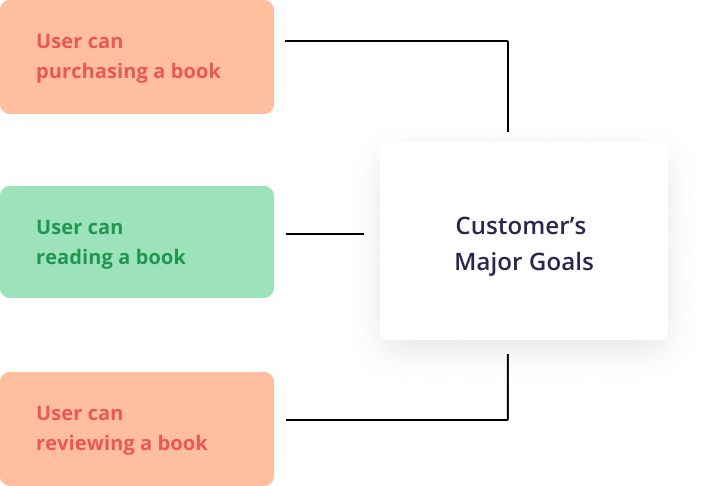
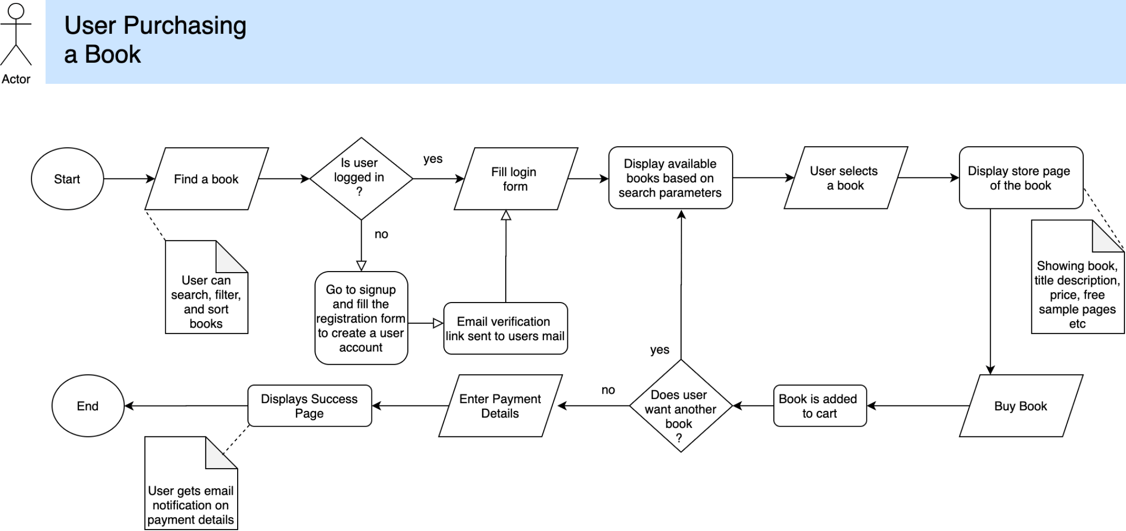
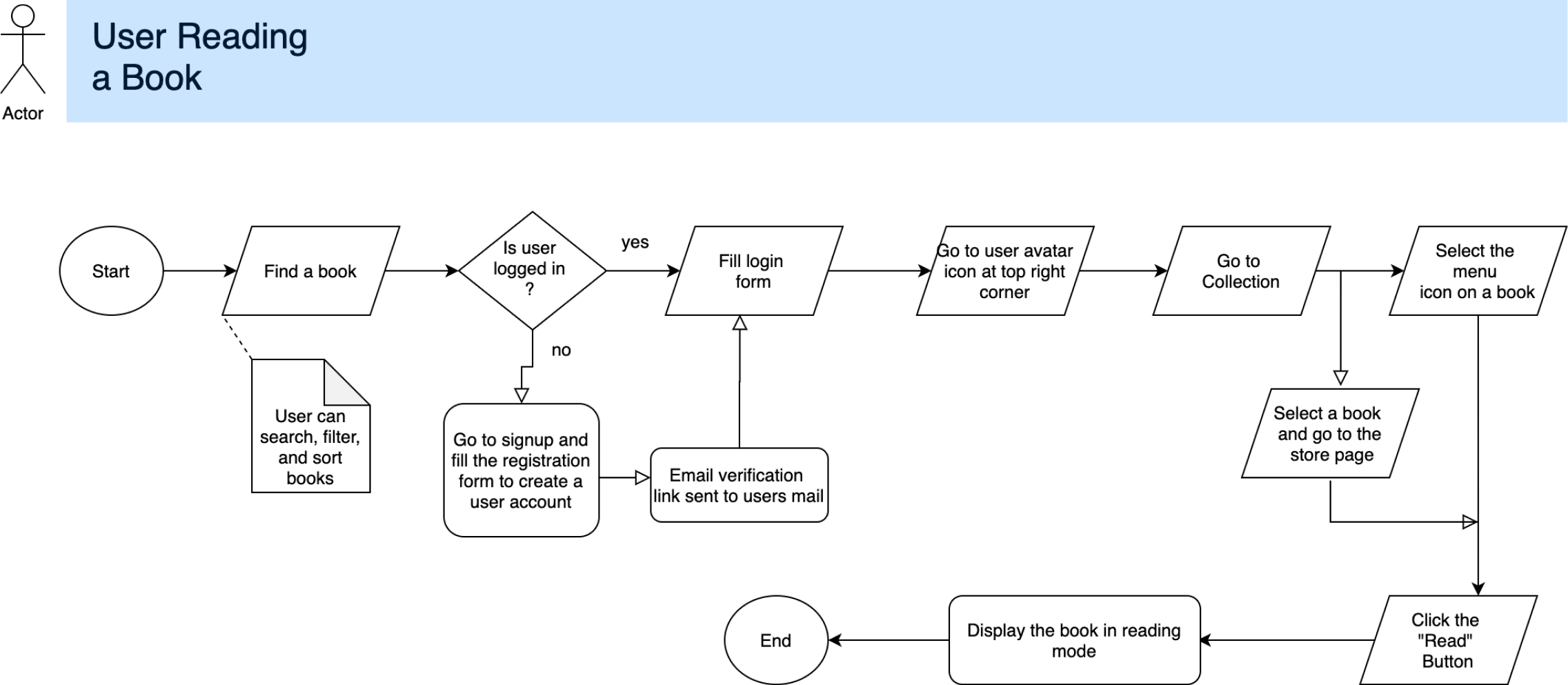
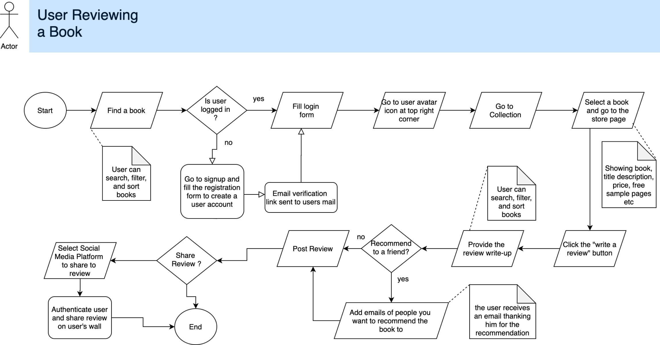
The next step was to come up with ideas based on the research findings in the user research. These ideas were all summed up in a process flow diagram that provided a high level overview of how the user will reach their major aim of coming to the platform.
Based on the project requirement, I was able to summerize the goal of the customer into three key process flow diagrams:
- User purchasing a book
- User reading a book
- User reviewing a book
Wireframing
Well equipped with a clear understanding of the user’s experience, I proceeded to the next step which is creating wireframes based on the process flows represented above.
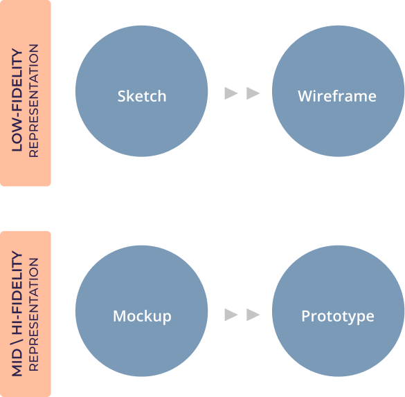
The following design process was adopted for this stage:
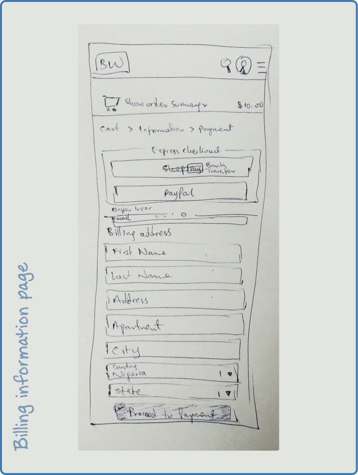
- Hand Sketch
- Wireframe Design
- Low Fidelity Mockup (for mobile and web)
- High Fidelity Wireframe (for mobile and web) Prototyping
Am also going to use the mobile first design philosophy because this helps me to ensure the users' experience is seamless on any device as most of the target customers all use a mobile device
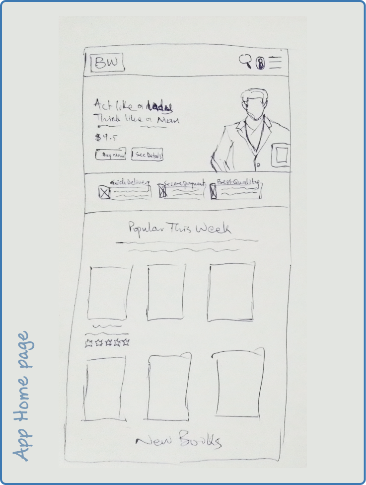
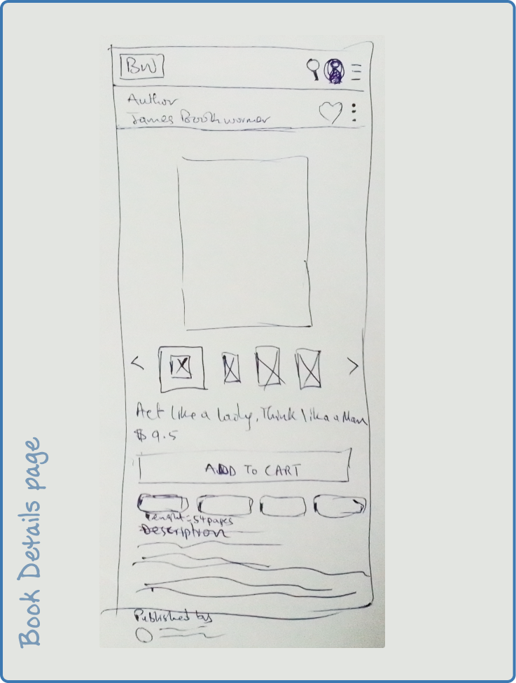
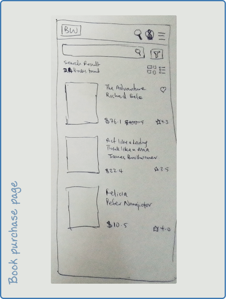
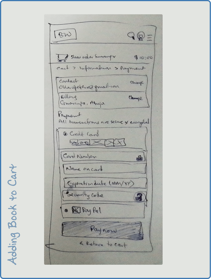
Handsketch Wireframe for the bookstore marketplace
Low-fidelity Wireframe for the bookstore marketplace
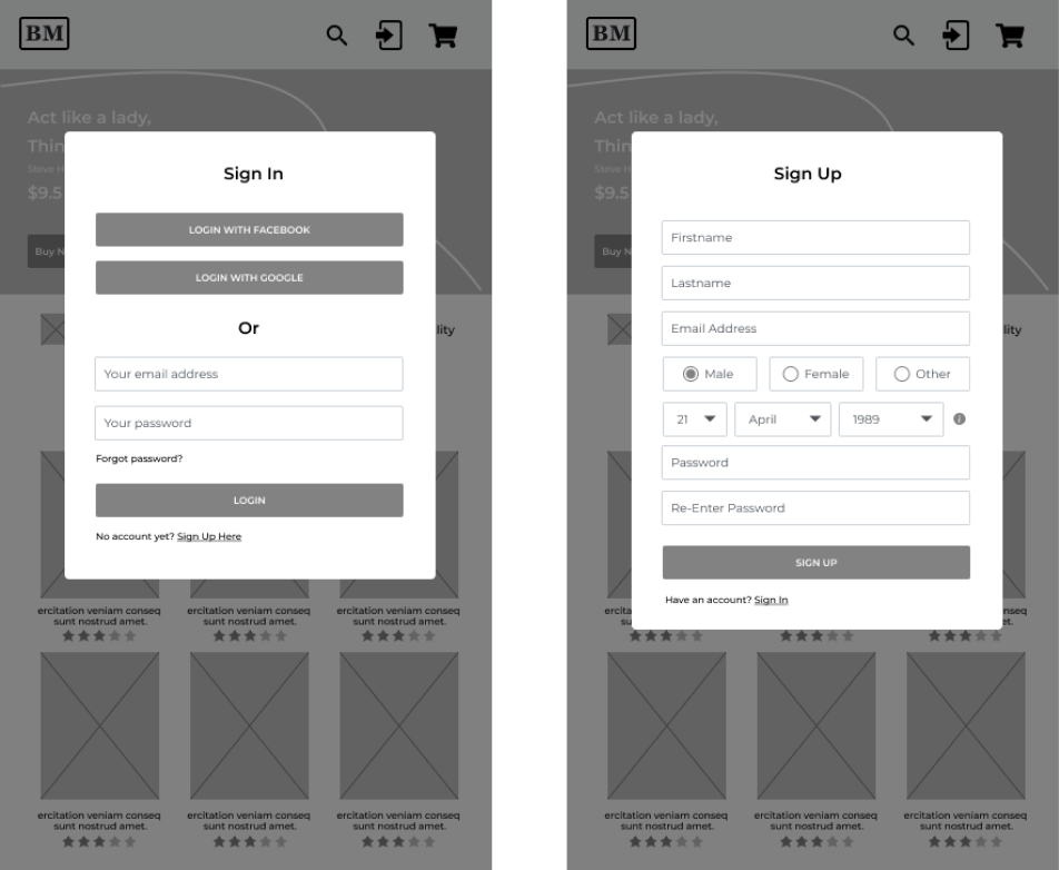
User Signup
Customers are expected to signup on the platform before they can access all the futures on the Bookstore marketplace
Home page & Book Details Page
The home page allows the customer to get acquainted with the store and easily see the store’s book details of each book they are intrested in.
The Book details view also allows you to view the book’s parameters, description, and review. You can also look at the sample pages of the book on the page

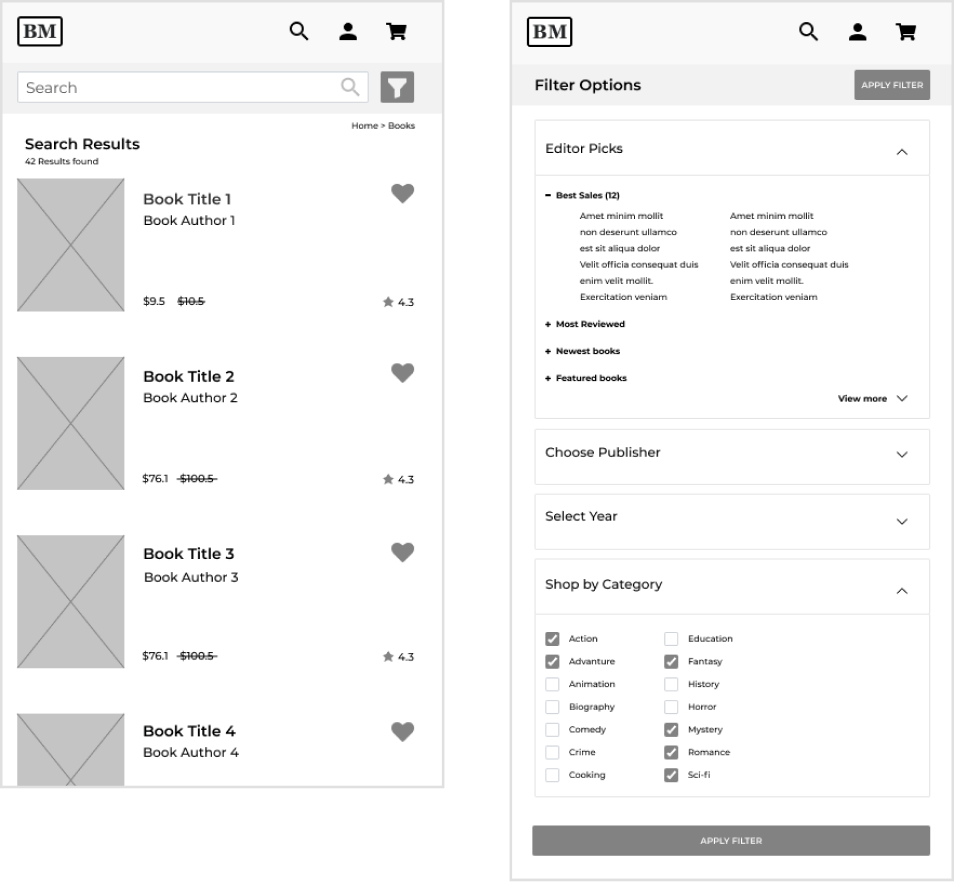
Book Search & Filter
Search allows the user to not only search by author or book title, but also by filter by category, price, and other factors.
Book Purchase
When the customer is ready to place an order we will proceed to the purchase stage. In order for the process to run smoothly it was divided into two steps

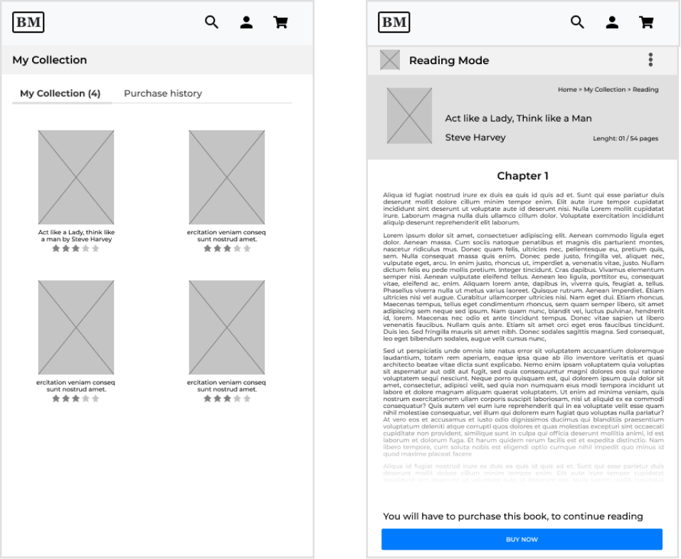
Customers book Collections & Reading Mode
After a customer has purchased a book he/she can still access their library of books had bought and read them for as many times as they want to.
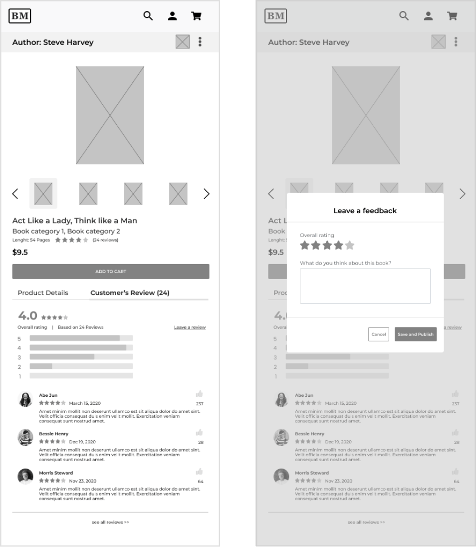
Reading Reviews on the app
Customers can see reviews from other users and also write reviews based on their personal feedbacks
Typography and colors for bookstore marketplace
When designing brand deciding the branding of the app, my aim was to achieve brand loyalty from customers. Creating a strong brand personality and mood, so that the brand can be well managed over time, and at the end lead to a positive brand image.
For a modern and sleek look, I decieded to use a sans serif font family called “Montserrat”.
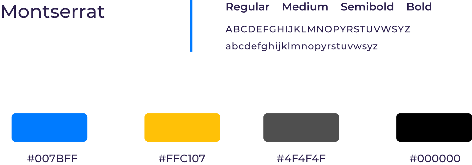
Also because people tend to associate feelings with different colors I decided to go with the above four colors of the brand as the most prominent colours for the app
Mobile High-fidelity Design
The high fidelity wireframe design for the bookstore app captures the look and feel of the product in the advanced stage of the design process.
In this stage I have gone beyond the placeholders and ‘lorem ipsum’ text of low-fidelity wireframes to include actual content, typefaces, colors, image dimensions, and branding elements
Using spacing for balance
Blue: 60px / 40px tap area for any thumb size
Green: 15px spacing from edge of screen
Purple: 15px around grouped components
Orange: 15px spacing between component groups
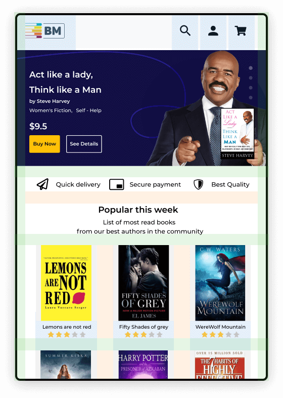
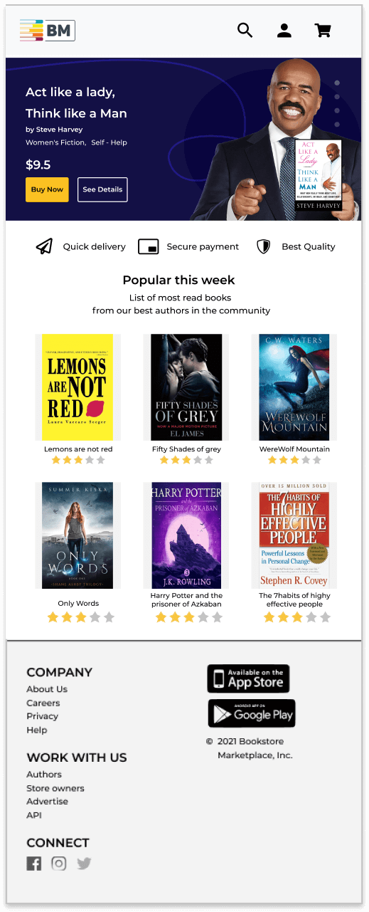
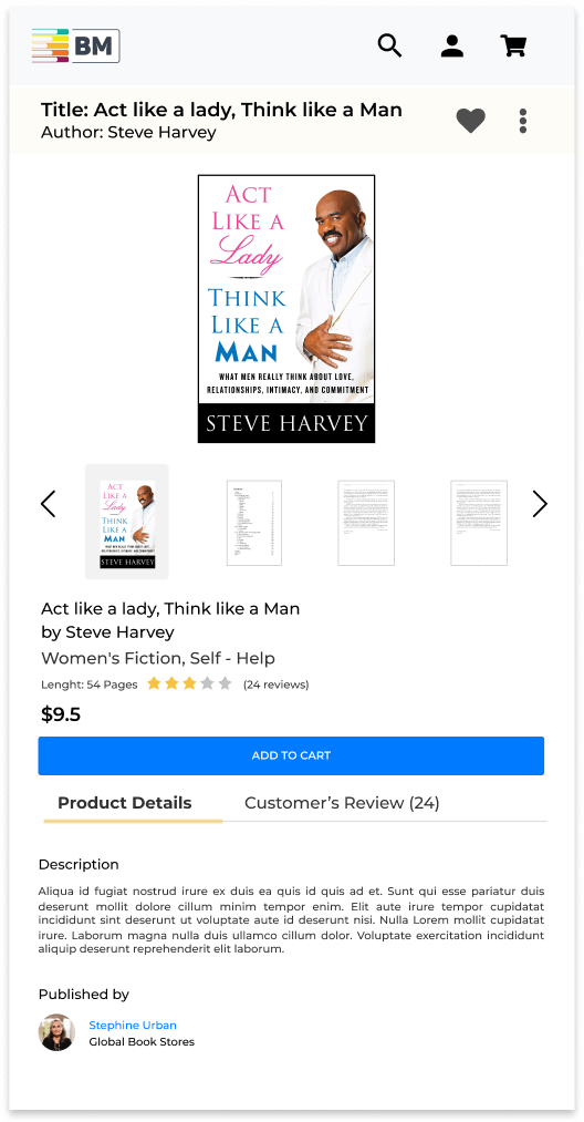
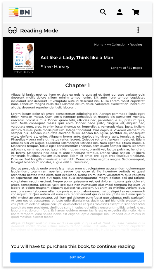
High-fidelity Mockup Design
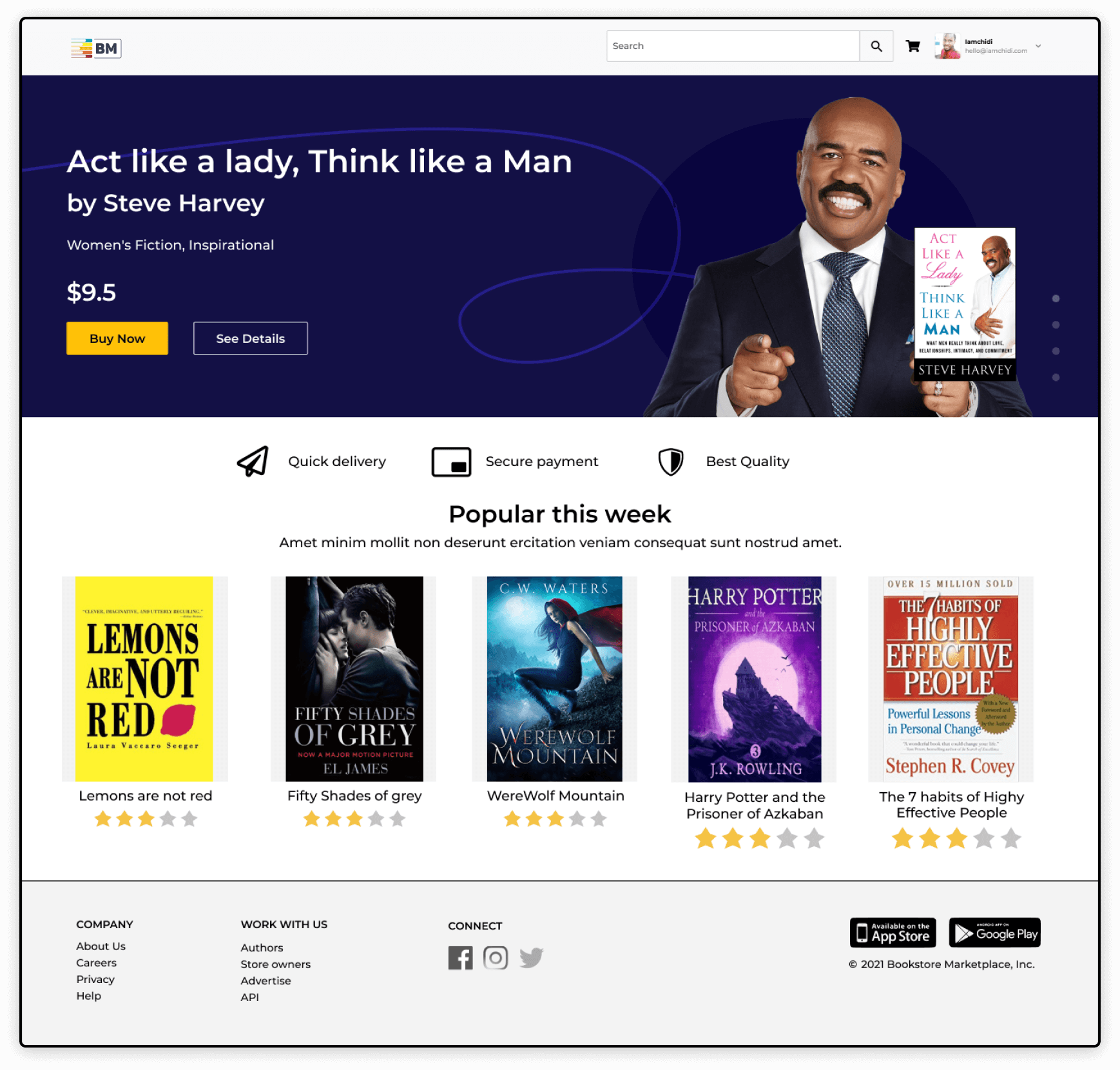
Prototype Design for the Bookstore marketplace
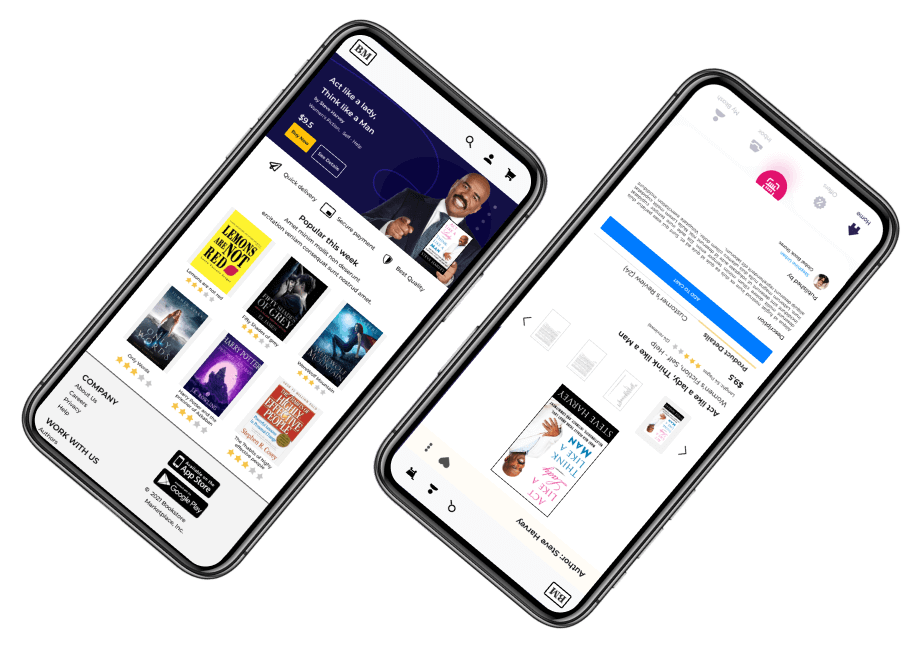
The final step involved converting the wireframes into visual designs. The prototype can be interacted with as you would a interact with a functional website
PS: If you get stuck on the figma prototyping interface, please click on anywhere on the screen and a blue highlight will show the sections that are clickable.
Some challenges I faced
As much as victories were recorded, there were major huddles I encountered during the course of this project. Due to time constraints, the research was majorly forcused on the customer user group and did not cover the "Adminstrators" and "Store Owners". To bring the project to frution the design flow for the above user group would also need to be documented.
Measure of success
Prior to the launch of this project, to determining the measure the success, the metrics below will define success or failure:
- ♦ How much time users are taking to find and read a book ?
- ♦ Overall experience rating.
- ♦ Evaluate cross-sales revenue (Conversion rate of purchase confirmation page)
Next steps 🚴
- ♦ Touch base with key stakeholders of the project to agree on execution plan, communication channel, review cadence among other modalities.
- ♦ Developer hand-off with zepline and work closely with developers to ensure a polished output.
- ♦ While the developers are starting to develop this flow, continue designing other outstanding interactions, covering all possible scenarios. Agile.
- ♦ A/B test before any full blast release. Making sure the success metrics are accomplished. If reading or purchase rate is going down, stop, analyse, iterate and test again.
- ♦ Setup tools like Hotjar to trully understand what users are doing. Make the necessary changes accordingly to what was observed and noticed as a problem.
