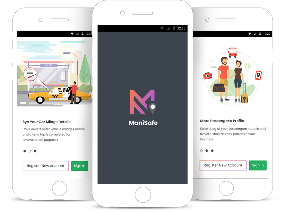
ManiSafe
— UX, UI design —
Provided
services
- Logo Design
- User Experience
- Wireframing
- User Interface
The ManiSafe App is a simple application designed to help create, share and capture vehicle logs for mileage before/after a trip, passenger's details and trip history / summary.
The Challenge
Running a business comes with different challenges and huddles to overcome on a day to
day basis such as keeping a healthy record of car usage,
and analysing the profile of passenger's records that patronise your business.
Do businesses really need this?
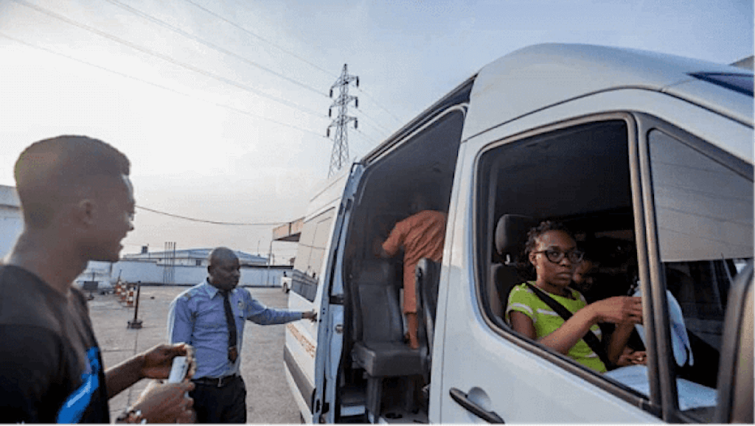
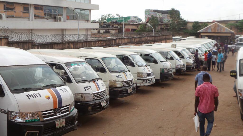
Small, micro and medium enterprises are important drivers of growth into the transportation business in Nigeria and across Sub Saharan Africa. The potential benefits of vehicle logging are to run an effective back office as regardes recording details of passengers, and avoiding cash flow problems.
Validating relevance and target user
As a logging tool that can be used in a wide range of scenarios, we identified our potential users to be small and medium transport businesses offering the service of taking passengers from point “A” to point “B”. In order to gain deeper insight, we conducted an in-person and observatory qualitative research to validate the idea, uncovered pain points and understand standard and unique practices common to businesses.
In-person interview
In order to understand the target users in detail, we carried out an extensive in person
interviews with 15 business owners.
Most business owners are busy individuals, we needed a quick and undiluted response to a set of
questions we structured to gain a deep level of understanding of their business process, hence
interview as a preferred research type.
No.of businesses interviewed– 15 (~35mins per session).
Edge cases discovered by observation
- Pricing and discounts – Customers can not bargain and pay a discounted price, however business owner can add discounts on the cost of each trip depending on the period of the year.
- Multiple payment method – Some customers could decide to pay the cost of their trips in cash or with the use of a debit card.
- Load Vehicle for Departures – For some business, they start to load the vehicle when the car seats are is fully booked while others load as the passengers book the available seats.
- Single cashier – Most businesses have just one cashier who records the details of the passengers in a log book after their payments has been collected.
- Driver Assignment – Once a vehicle is fully loaded and ready to go, a driver/captain is assigned to take the passengers to their destination.
For the ManiSafe app to successfully hit a sweet spot in the heart of the users, it must have to deliver on the following;
- Seamlessly work online and offline.
- Record the entire trip lifecycle; i.e passengers profile, how much they paid, what payment method did the passenger use, what time was the trip created, how long was the trip and what distance was covered during the trip? .
- Ability to store the car mileages before the trip and after the driver ends the trip.
- Trip summary in a digestible format
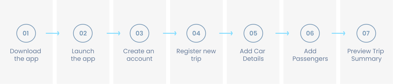
Determining the path to a users ‘aha-moment’
To create a winning new user experience that ensures that users experience the value the app offers, I first of all had to identify each step in the customer’s journey towards the aha moment (moment of value realisation), for the ManiSafe app, I identified that to be the following.
Determining most significant metrics and growth equation
It’s important to start early to think about important metrics for measuring growth and success and how to neatly build in elements to improve them in the design. For ManiSafe, the most significant metric also referred to as the north star should be the metric that most accurately captures the core value being created for the users. DAU. The clarity of the north star helps to keep every other thing tightly focused. With this in mind, I ensured I made design decisions that’ll ultimately improve the dau especially for newly on-boarded users.
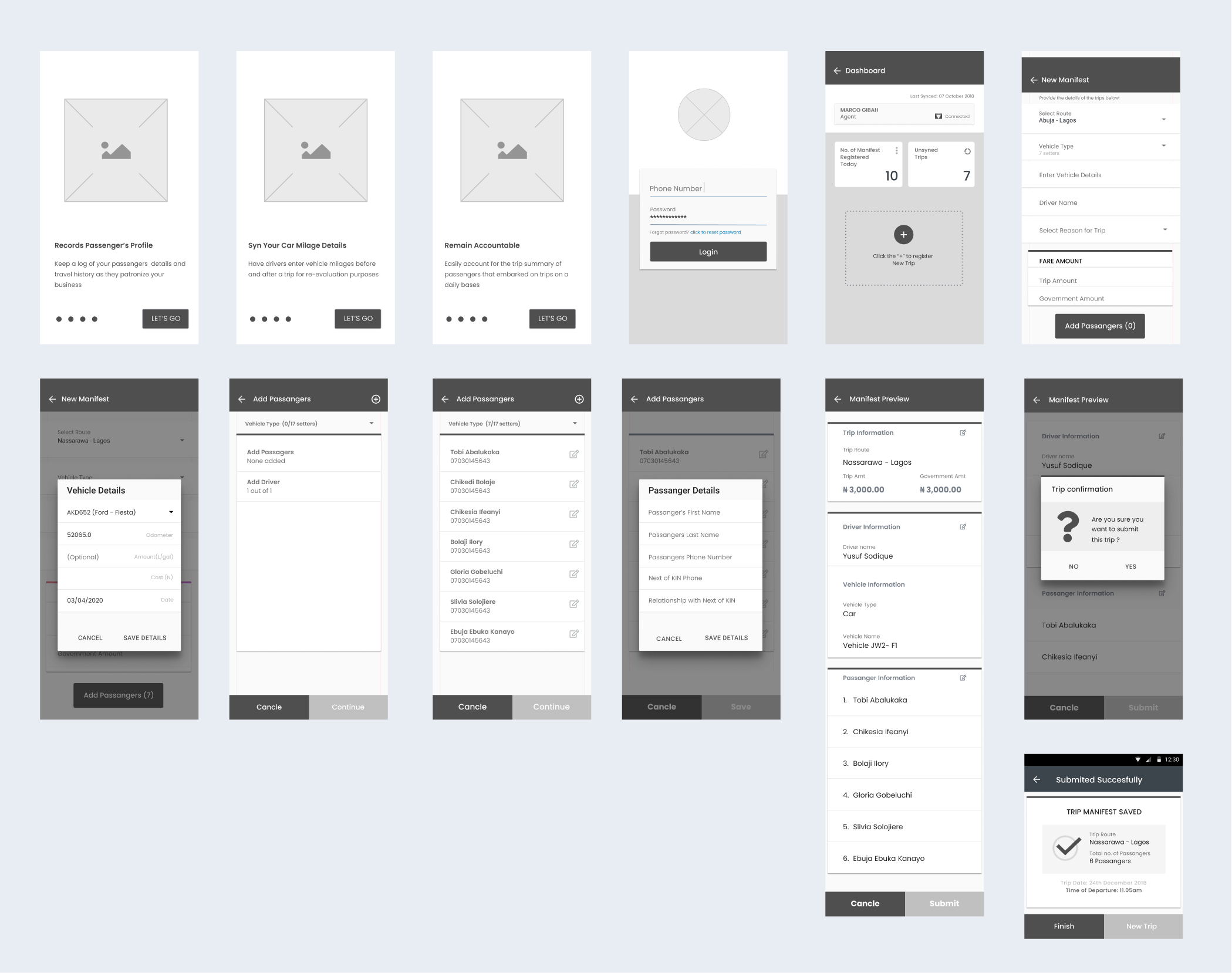
Ideating and prototyping.
I started to generate my ideas with hi-fi wireframes which allow me to fail fast and to fail cheap. I learned in a very early stage of the design process what works for the users and what might need adjustments or need to be changed.
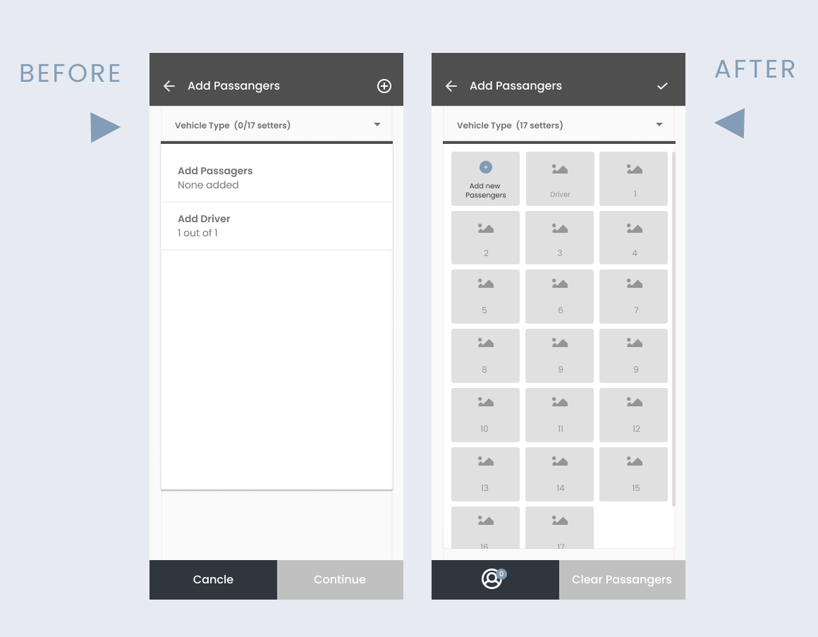
Testing, findings and iteration
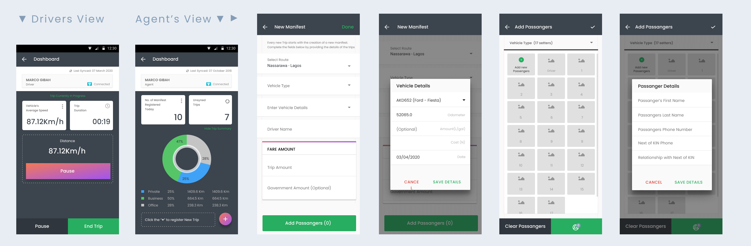
With a hi-fidelity wireframe for a new user experience path, I went ahead to run a usability test to test for clarity, ease of use and opportunities for improvement. One huge discovery was the high cognitive effort required to add a new passenger. This will work fine for a private car owners (like Sienna and Taxi) who aren’t really picking up a lot of passengers but will create churn for transport companies with larger passengers.
Improve motivation to add passengers
To increase the ease of adding a passenger, I sort to increase the affordance for the page, in addition to giving the user a nudge by using placeholders that’ll increase the motivation to add a passenger. Also, in a glaze, the coordinator / agent is able to tell what seat it available and not yet occupied by a passenger. This helps to satisfy the preference of passengers who like to sit close to the window or sit with the driver in the front row during the journey. As a result, there was an increase in the rate of adding passengers.
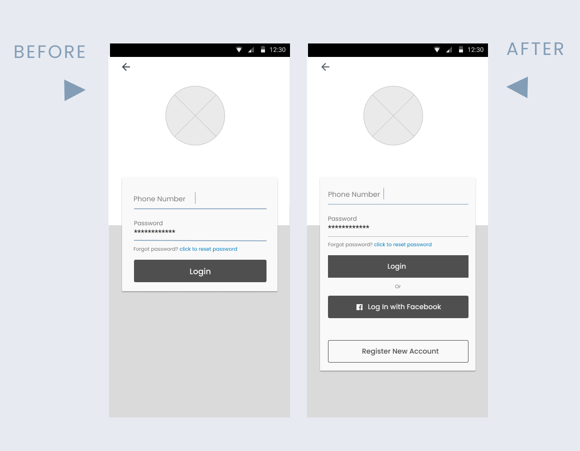
Optimize user login
As also discovered from the test, the number of people that forget their login credentials seem to be more maybe, because they used a lengthy password or simply because they can not remember it anymore. On a closer look, I discovered that I can introduce the concept of social media login allowing them a seamless experience during login.
Summary of final visual outcome
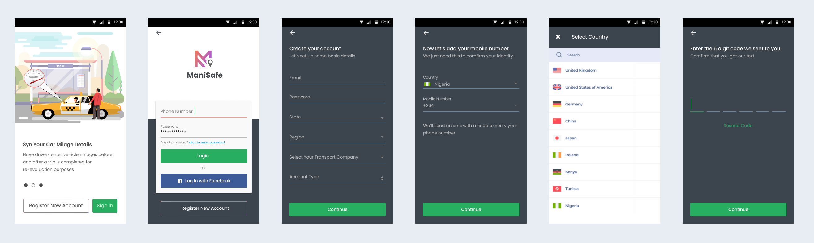
Signing up a new user account
As a primary entry point, it was important to make this step as frictionless as possible. A few ways was giving an option of a social sign on using facebook. Based on my research a high percentage of the intended users were all on facebook hence this will boost the time it takes to get started. I also broke down the flow in chunks to avoid information overload.
Viewing trip summary
As the most valuable section of the app, designing for clarity was the goal for this page. The core goal is for a user (driver/agent) to access the core financial metrics of the business for the day without the need to scroll. In addition to a clear navigational structure while digging deeper into details.
Test! Measure! Iterate! and repeat!
Launching a product is only the beginning of a journey, hopefully an endless one. The survival of any product greatly depends on testing, measuring and iterating. Which is why I also like to think of how to measure success right from the design phase. A few critical data points would be;
- Language/market fit – How well the language used in the app to market to potential users resonates with them and motivates them to give it a try.
- Conversion rate for every step in the user journey
- Event tracking to measure expenses during a trip.
- Daily active usage
Failures and lesson learnt / limitations of final solution and suggested improvements
As much as possible, the product team should always start from the user and work backwards, by turning user pains into features rather that doing it the other way around. The solutions proposed at this phase are subject to refinement through data insights, experimentation and iteration. It’s also very important to take first time experience very seriously as it can make or mar a products success.
Share this
— Thanks for watching —
Let's work
If you have any interesting project in your mind and looking for a creative designer, just leave me a message and I'll contact you soon.